


TL;DR Some time ago I've declared my little, private war ... War against misleading, illogical & inconsistent depicting of solution architecture by people who either intentionally or due to their ignorance mix simple (yet very different) concepts i.a.: logical view, physical view, functional view. This is the post about this warfare ...
I believe many of you (the ones who work in large enterprise environments) have seem diagrams like this:
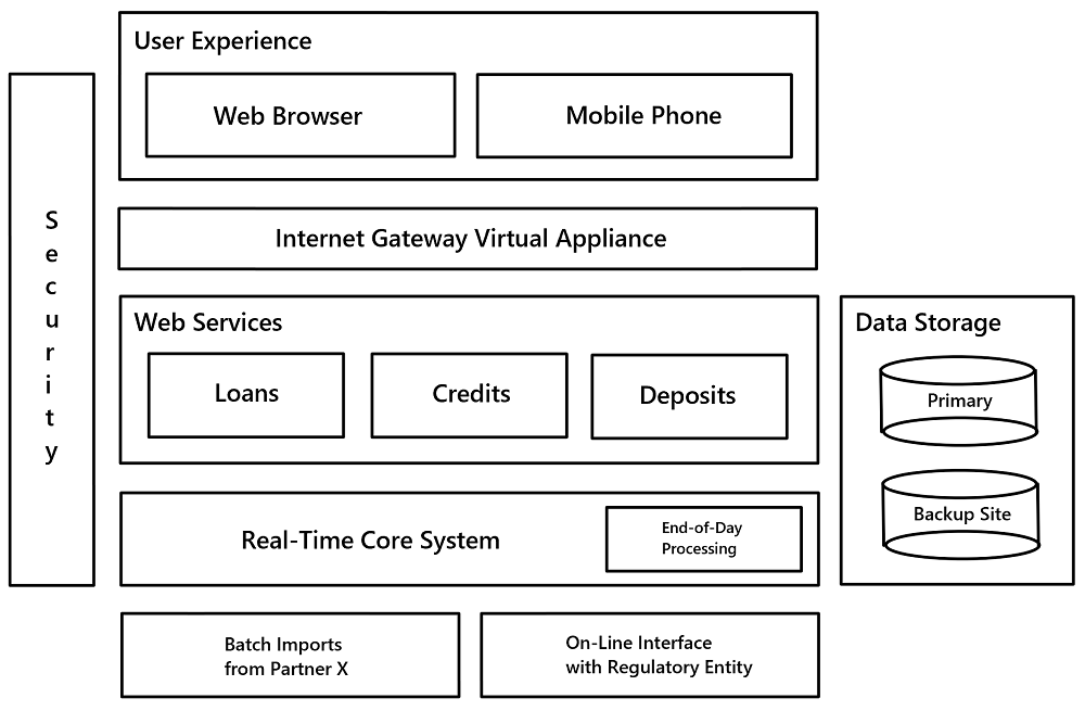
I've forged this one, of course. The ones you've seen may look a bit different, but I'm sure you recall the general idea of half-random clusterfuck of different size boxes in vertical & horizontal hubs, usually coloured like a rainbow (I've spared you this "feature" ...). If you spend a minute to grok through some of them, they share few very similar "qualities":
- they completely mix different perspectives (you can call them - dimensions) of architecture, e.g. putting physical machine side-by-side with functional domain area
- of the perspectives (/dimensions) - none is complete, elements seem to be chosen more or less randomly (comment: I don't mean 100% completeness, but completeness on some detail level - e.g. if you're going down to "package" level, list all packages)
- interactions (lines, arrows) depicted in the same way are actually of a very different kind & nature -> they may be data flows, interactions, dependencies, ... also - if they are directed it's not clear whether it's a direction of initiation or direction or data flow ...
- layouts are inconsistent (that ofc maps to the meaning they are supposed to reflect) - dimensions (X, Y, sometimes also hubs "within") serve mainly some unclear grouping purpose (which is not bad by-design), but ... very frequently grouping criteria are inconsistent even within a single diagram!
Carefully tailored message
These are just the major sins, but I'll stop here. Why people do produce such misleading, visual crap? Here are two major reasons:
- Theoretical intentions are truly benevolent - to create a visual overview of whole (?) solution that is as simple to grasp as possible, while still being "complete" & utter (in the same time) - because the usual target are non-tekkie senior executives with a very short attention span, busy schedules & limited ability to delegate on their trusted (?) subordinates
- Additionally in many cases authors actually have a very skewed & limited perspective on the solution - due to lack of knowledge, experience or understanding they depict "flattened" snapshot & interpret it wrongly
But everyone seems happy - decisive people (money holders) are being presented information they feel comfortable with (as they recognise vast majority of present labels & approve the overall simplicity).
Went into a meeting with a fortune 500 C-level team and OH: “the goal here is to minimize details and maximize understanding.” Mmmkay.
— Mitchell Hashimoto (@mitchellh) August 28, 2015
They are not able to validate the actual completeness/correctness (due to lack of technical/architectural expertise), but if one goes through elements & links one-by-one, they all seem understandable, legit & sensible.
Hell they are. There's one golden rule you should never forget about:
garbage in ---> garbage out
All the reasoning / consideration based on such an incomplete & erroneous information is by default questionable, unreliable & very risky!
Diagram is a vital part of any documentation - brief & striking equivalent of textual description: so it has to be precise & unequivocal. Obviously no useful diagram covers literally everything (as notations are more concise, but also more limited in terms of level of detail that can be expressed), but there should be very clear boundaries, "resolution" & "filters":
- specified dimension / perspective (don't mix apples with pears)
- set detail level (height in "helicopter overview")
- unambiguous (regardless of the level) notation - shapes, links, groups, layers/tiers/lanes, colours, etc.
- criteria of what's visible (e.g. only security subdomain)
Does it possibly require involving several people with different specialties (domain architect, product manager, application architect, infrastructure architect, ...)? YES, live with that.
Does it mean that complex solutions just can't be depicted on a single diagram? YES, it shouldn't be that much of a surprise as we speak about "complex" solution, aren't we?
P.S.
One more thing: don't get me wrong here - I'm not vouching for sticking strictly to any formal notation - like UML or ArchiMate. Actually in real life it's just not sustainable long-term. What usually works best is the most basic "shape" notation (boxes, circles, arrows, ...) with a clear map legend to clear out auxiliary symbols / colours.
Pic: © Slavomir Valigursky - Fotolia.com


