


A side note before I even dive into the actual topic: I've never been an enthusiast of Wardley Maps (WMs). I always found them un-intuitive, subjective, and vague (because they are not based on any numeric, "hard" data). However (surprisingly for myself), recently, I've found them as a very useful conceptual tool in my conversations with startups (on par only with Lean Startup Canvas).
As I frequently repeat - the most important resource of every startup is the focus of its crew: they should ONLY be working on what constitutes their competitive edge (their "secret sauce"). But not every startup can intuitively name that crucial ingredient! And that's where WMs are priceless - as a tool for visual, collaborative value discovery & "mining".
Have you ever tried it yourself? No? You'd like to know more about how it works? I've got you covered.
The "graph"
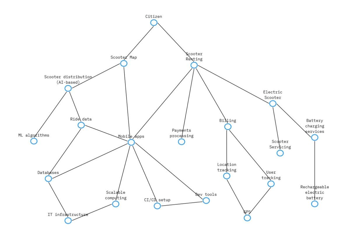
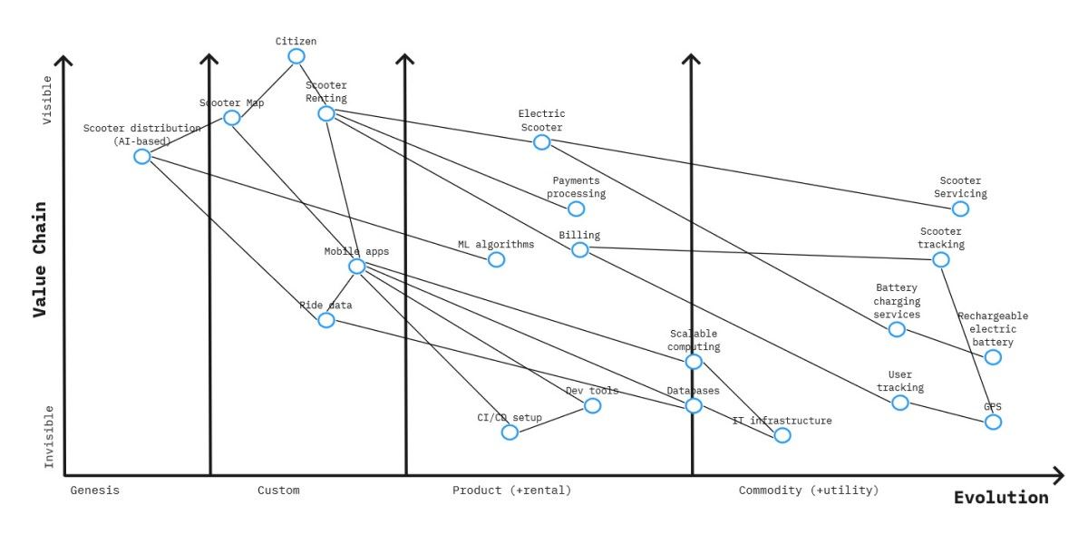
What is a Wardley Map? It's a visualization of a dependency graph for your business's value "carriers". Sounds unclear? Let's illustrate it with an example then - how about electric scooter rental services? They are so popular these days that it should be easy enough for everyone to follow and understand.
Imagine the highest value "component" of the system (not "IT system", but a system as in system's theory) - this is where we start. In this case, it will be a user actively using your platform ("Citizen"). Then you subsequently follow with its dependencies: other essential "components" that enable the user's value. To be a user, one needs to be able to:
- locate a nearby scooter that is online, charged, and available - some sort of a dynamic map is essential here ("Scooter Map")
- well ..., rent a scooter for a paid trip ("Scooter Renting")
Once you have all the critical dependencies identified, you follow with their dependencies - building the whole dependency graph on the way. Each subsequent "iteration" is typically more basic, generic, and less "mappable" onto the final value. The actual direction of the dependency relationship is (surprisingly) not important and rarely marked visually on the map.
That's not the end of it. We have the nodes and their connections, but what matters equally much is their positioning on the two-dimensional (axis: X & Y) plane.
The positioning
Let's start with axis Y (vertical). The higher the position on axis Y, the higher (more direct and visible) the "value" of the node. Intuitively you may assume that the initial node is at the top and the following node generations fan out below. Still, sometimes a dependent "component" is positioned higher than a node it depends on (and it's okay).
The positioning on the other axis - axis X (horizontal) - is a little bit more tricky: it represents the state of general maturity of the component. The more it is to the left, the more experimental and unique it is. The ones on the far right are very utilitarian, standardized, and commoditized.
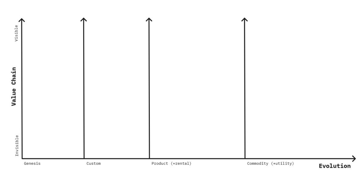
According to intuition, "components" that are lower in the map (axis Y) tend to lean towards the right side (axis X). Why? The most innovative components that play a significant role in building the competitive edge, frequently rely on the most basic, stable foundations.
Reading the map
Wardley Maps are not trivial to work with:
- First of all, yes, the map sometimes looks messy. Having each component positioned nearly independently, many dependency lines cross and clump up together.
- Additionally, there will always be controversies about exact node positioning. The opinions on both the value and the level of maturity will differ - but this exercise is not about the absolute accuracy but relative placement.
- Maps are not carved in stone - novelties get popularized, copycats appear, adopters adopt; that's why nearly everything in maps slowly drifts to the right (and some new stuff appears).
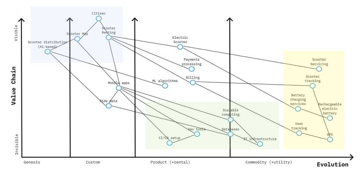
All elements on the map are essential (the high-value ones can't exist without their lower value dependencies) - but they should be approached differently due to their maturity (X dimension):
- the ones to the right are highly industrialized: reliable, scalable, fault-tolerant, but with a low margin - these are the areas where you compete with operational excellence and automation (and they already benefit the economics of scale!)
- the ones to the left are very experimental; failures and bad decisions happen here as they are the price of innovation - these are the areas where you compete with creativity and out-of-the-box thinking
To illustrate these differences, I've marked few groups of closely placed nodes with the same color:
- yellow ones are the commodity services that can be easily outsourced to the specialized 3rd party (servicing a scooter - e.g., replacing a flat tire) or are parts of popular SDKs (GPS location tracking for both scooter and mobile phone)
- green ones are popular IT products/services used by hundreds of thousands of companies worldwide (databases, IDEs, CI/CD tools, VM hypervisors, etc.)
- blue ones are where the company plans to be truly innovative to delight its customers: AI-assisted placement of charged scooters, highly interactive real-time map, convenient and fast scooter renting procedure
Nice ... but how to use it?
The general purpose of the map is to challenge your product development roadmap. Where do you intend to put your design/engineering focus? Having a heavily constrained, small team, should you really spend the next three months on ...
- ... setting up Kubernetes cluster from scratch?
- ... building a massive compute infra for massively parallel processing of ride data?
- ... creating a new supervised learning library to optimize scooter placement?
- ... building a tailored sales reporting solution from scratch?
Maybe you should. But if and only if your unique value proposition is all about:
- (best of breed) automated provisioning and governance of Kubernetes clusters (for your customers)
- building a better massive compute framework than any existing on the market
- inventing a new supervised learning algorithm that will outshine whatever has been created by now
- creating a next-generation Business Intelligence tool that will elevate the game for financial reporting
But if you're still in electric scooters rental ..., you should make sure you waste as little time and focus on those. Yes, these topics may be interesting. Yes, they may appear quick/cheap/simple for your super-smart engineers ("they'll do it in no time and save us some money we'd spend on SaaS/licenses/outsourcing"). But that's naive thinking with dire consequences. These distractors are not worthy (of your time and focus). None of the bullet points above serves the goal of creating the best electric scooter renting service!
Move along. Get back to the blue area.
Follow the map.
P.S. The map template (in Miro) is a canvas designed by Ben Mosior. Visit https://hiredthought.com/wardley-mapping for more information.
P.S.S. The map template is licensed under a Creative Commons Attribution-ShareAlike 4.0 International License, CC BY-SA 4.0. To view a copy of the license, visit https://creativecommons.org/licenses/by-sa/4.0/


