


Last week I introduced you to Inteligo (online banking experience straight from 2001) and presented its brief story (... of permanent stagnation). Now we can smoothly transition into comparing it with "modern banking customer experience" (the one you know from any bank you're using these days) to assess the real value of banks' "digital transformation" propaganda ...
Okay, so what did I learn out of this comparison?
The (usage) scenarios
First of all, it seems that my use cases for online banking services haven't changed AT ALL (and keep in mind that I do consider myself an early adopter of various novelties - I don't accept them uncritically, but I'm not afraid of experimenting). What is more, how I perform those use cases (e.g., check accounts history, make a money transfer, etc.) didn't change either! It's not faster. It doesn't involve fewer steps. The only major life-comfort improvements are about payment integrations, but those are visible on the merchant's side of transaction.
All the expensive ideas and experiments to make banking more "social" and "engaged" (e.g. via gamification, personal finance management, social media integrations) have failed miserably and got scrapped (because no-one wanted to use them) over the years.
Various "visionaries" and self-proclaimed "digital prophets" aimed to make banking more attractive and mix it with other, more appealing activities (in fact - to collect more data, open partnership opportunities, spur word of mouth marketing) - but they've all failed miserably.
Banking is meh
Why?
Because banking ain't "sexy", and it will never be. Banking is a basic, low-level service of either keeping, saving, or lending money. Nothing more. Such a service has to be secure, stable, rock-solid, trustworthy, fast, and SIMPLE. It will never be "attractive" (people will not "like" it) - banks are not there to be liked.
Banks are an unpleasant necessity - no one uses online banking "for fun". It's not money that brings joy, but what you spend that money on. The fact that there has to be a payment activity during the transaction is always an uncomfortable inconvenience - the goal is not to make it enjoyable (because it's impossible) but to reduce the annoyance (by limiting the exposure / making it transparent) to a minimum.
Security
Security is probably the area with the most meaningful improvements (when it comes to online banking sites/apps), e.g.:
- inconvenient 2FA methods like scratch cards have been replaced with SMSes or in-app approval (like the one in iPKO's mobile app named IKO)
- to avoid getting tricked by scammy, bank-look-alike fake sites, banks ask the user to set up a dedicated visual symbol (that acts as a tiny but unique personalization token) - it actually had been added by Inteligo a few years ago
- mechanisms like 3-D Secure provide an additional layer of protection when it comes to card transactions securing (when initiated on merchant's site)
I wouldn't call those a revolution, rather a set of point improvements, but they are still worth appreciating. Is the list long enough for almost 20 years of online systems evolution? I leave it to your judgment.
Bloat
Okay, so I've already indicated that the use cases list didn't change and the same applies to how I perform them. But that's a bit of an over-simplification. In fact, there's a significant step back: in terms of UI clarity, cleanliness, and brevity.
Old Inteligo interface may be outdated and ugly, but it's optimized for usage efficiency, e.g.:
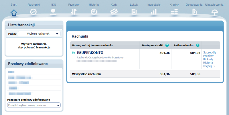
- I have pretty much everything within one click range from the main dashboard: history for the chosen account, a transfer to a pre-defined recipient, my cards, etc.
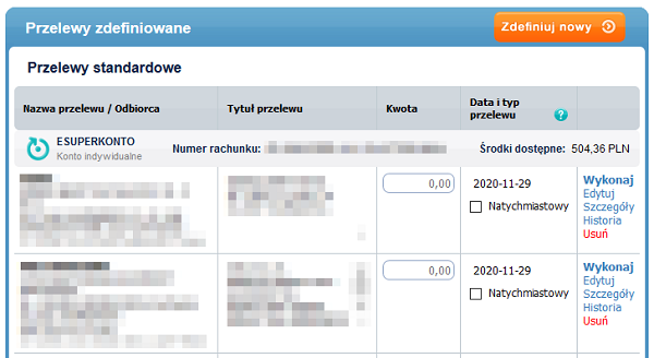
- I can execute a transfer for the pre-defined recipient straight from the list (each row has an "amount" field for that purpose!); there's even an expected transaction date separately for each entity on the list
Surprisingly, more "modern" iPKO fails miserably in areas Inteligo does not. Wanna examples? Here we go!
- LastPass does not work properly on the login page - the page does not correctly recognize automated content inject if you don't fiddle with the field's focus; I know LastPass is a 3rd party tool, but AFAIK it's one of the top 3 (with 1Password & Keepass) and we're speaking about recommended security practices here ...
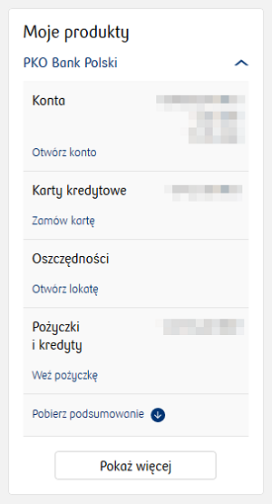
- Instead of terms established in the customer's vocabulary ("credit", "loan", "deposit", "card") the navigation uses words from the bank's lingo/perspective (e.g., "my products" - a category where you have both loans and deposits stashed together ...)
- The interface is generally optimized for sales (and it's screaming it!) - e.g., there's a shortcut to product categories, but it's pretty useless because it contains a non-interactive summary and ... yes, you've guessed right - for each category, an "add new" / "buy more" button; this may make sense for consumer goods in retail (tempting ...), but in banking?
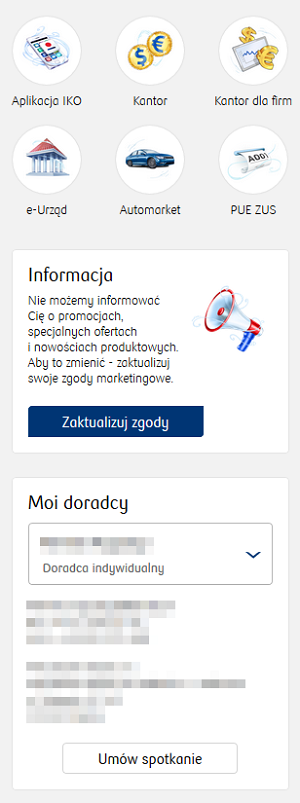
Of course, that's not the only piece of insolent sales-oriented bloat - if you haven't agreed to receive marketing communication, there'll always be a widget nagging you to change it; there's no direct button to your card operations/statement, but you can arrange a meeting with your sales advisor in just one click ;P (also on the main page). And obviously there are exposed, space-wasting icons (on the main screen ...) to all the offered services I've never ever used (like "Automarket", "Kantor", "e-Urząd", etc.).
Advisory role
Hey, but banking ain't just about having a clean and informative user interface. Maybe banks in 2020 are ... smarter? Well, the 2nd most favorite buzzword in banking these days appears to be "big data" - what if banks actually use all that data to advise their customers better (provide more adequate product recommendations, emphasize contextual actions, etc.).
LOL, no they don't.
A "modern banking" story that has happened this month:
- My credit card got temporarily blocked because of a (legit) transaction from Singapore; I don't mind the fact it was blocked (I assume it was for security reasons), but I've only got an SMS message about that - UI didn't create any notification/reminder, generate any shortcut to deal with that situation (e.g., resolve blocked transaction) - I had to dig through few nested screens only to find out I need to call the helpline to unblock the card ;P
- During my helpline conversation, I was offered a product - some sort of a cash loan; it seems smart for the bank to use every opportunity to sell, but ... it was ridiculous because of the amount of free funds I had for at least a quarter (deposit rates have plummeted, so I didn't open any investments) - more cash was actually the last thing I needed and any logical, automated recommendation system should easily reason that
- After my kind rejection, I've got a proposal of raising my credit card limit - while in fact, I've never managed to reach more than 30% of my current limit ... Are they random-generating those offers?!
Nothing could be done?
Maybe I'm expecting too much (in terms of an advice)? Well, what about the very basic thing - visualizing the current account's balance history (to provide some graphical cues and insights)? This could present in a brief, clear way answers to some fundamental questions like:
- what was the minimum balance in 2020?
- am I accumulating money, or does my expenditure exceed the income?
- how much piggy-banking could I afford while keeping my balance safe? (with some fixed risk reserve)
Believe it or not, I've found NO visualization AT ALL in the 2020's version of iPKO. Just raw, tabular data that I can export in a convenient format. Well, I know spreadsheet-fu, so I can do my own magic in Excel/Google Sheets - but it sounds like the first thing bank could support its customer with ... At least provide visual comparison of its offers (how much you can save with X and Y) ...
The other example is all the digitized documents banks are attacking you with - regulations, policies, instructions. There's plenty of them, they are very long, and they do change quite frequently (so you get new versions as updates). A smart person could come with tons of ways to make them more approachable and ... truly useful (instead of cryptic). E.g.:
- summaries
- stated purpose of a change
- an option to visually compare previously accepted version with the new version (to focus on differences only instead of reading through 40 pages of legal jargon)
- examples (especially for tariffs and calculations) + visualizations
But no, nothing has ever improved in that area, while in the same time banks boast about using blockchain to store the customer agreements. How ridiculous is that? What kind of problem does it really solve?
Conclusion
However crazy it sounds: the bank straight from 2001 is AT LEAST as useful as the modern 2020 bank. At least (but maybe even more, because it's stripped of all the bloat). In contrast to boisterous announcements & PR messages, the "digital revolution" in FinTech rarely goes beyond CSS replacement.
Yes, it may appear that all my reasoning's based on comparing Inteligo with iPKO. But AFAIR I had used online banking (at least a basic current account) in 6 polish banks since 2001 - NONE of them has introduced any feature/change/improvement that has meaningfully changed the way I save/use/spend/loan money.
Now compare it to other industries. Which of them could afford a nearly two decades long coma?


