Some say that the most important prerequisite for dealing with a problem is admitting its existence. So yeah, I'm probably addicted to mechanical keyboards. If I remember correctly, I now have six fully operational, top-notch models already at hand (2xDasK, 1xWASD, 2xKeyboardio, 1xKeychron). The recent addition to the family is Keyboardio Model 100 - acquired via its Kickstarter campaign (backed in July 2021 and collected in Oct 2022). But why the hell did I decide to "invest" almost 300 bucks in yet another clicky nightmare of all open spaces?
It's complicated ...
First of all, I wanted to try an ergonomic keyboard for once. I've always used models based on a traditional layout of IBM Model M - but after trying a compact Atreus, I was much more inclined to experiment with unorthodox layout ideas.
Additionally, I wanted a keyboard that is much more flexible in terms of positioning (tilt, split parts for both hands) - I have a restricted desk estate & tons of stuff that occupies it that I don't want/can't get rid of.
I also felt slightly disappointed with the physical feedback of the two recent additions to my collection. In the case of Atreus, everything feels somewhat too clumped up together (frankly: that's the idea - it's supposed to be a portable device, but you know - the pandemic happened & I do not travel as often as I did in the past), and the experimentation with a low-profile mechanical keyboard (Keychron K3 v2) was pretty much a failure - albeit Bluetooth connectivity is cool (especially when you need to switch between 3 computers), the touch'n'feel is not even comparable to "traditional" mekkies.
So yeah, now I have used M100 since October 2022. Why did I wait for so long to write this review, then? In the first 2-3 months, I didn't use it 100% of the time, as I didn't have a proper KVM, and constant replugging was a pain in the arse. But since December, I've re-organized the cable-device connectivity switching, so I have used M100 for pretty much everything (work, fun, code - you name it) since then. That seems like enough time to assemble a proper summary ...
What kind of animal is that?
M100 is not a completely new design but an improved version of the popular Model 01. What are its key features?
- Its base is made of hardwood, which is pleasant to touch and makes the keyboard very stable (with your palms resting on it completely).
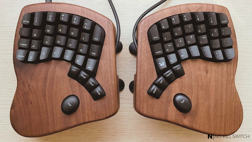
- It's split into two parts (connected by cable - more on that later) that you can position nearly independently. The parts are heavily profiled (incl. the keys) and mutually symmetrical. In my case, they are mounted on a stand kit that lets me freely adjust their tilt (that came for an extra cost of 25 USD).
- There are 64 keys - all lighted with RGB LEDs and powered by hot-swappable mechanical switches (in my case: Kailh BOX White - clicky ones). I wasn't bold enough to buy a blank version this time, hehe.
- There's no Mac/Win switch - the keyboard has the following control keys: "fun", "ctrl", "cmd", "shift", "alt", "prog", "any", "led", and ... butterfly :) (Keyboardio logo).
- And ... that's pretty much it - no fancy mini-displays, media panels, knobs, or touchpads. Quite a minimalist device focused on one single thing - typing.
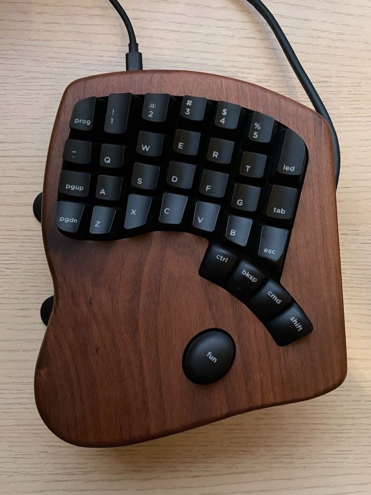
The keys are big, so even with just 64 of them, the keyboard needs a lot of space on the desk. The set comes with a high-quality case, two different cables to connect the parts (short & long), interconnect bars to turn the parts into a single keyboard in a stable manner, and some disassembly tools (a puller and a screwdriver if I recall correctly).
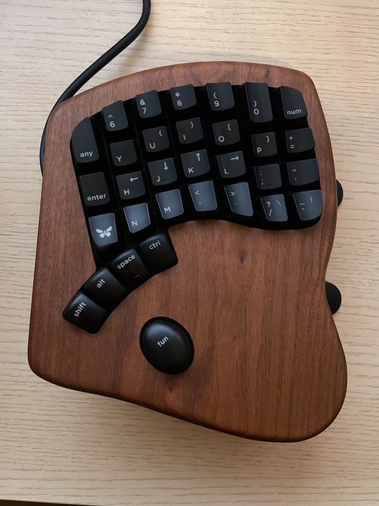
One does not need any specific software to use M100, but if you want to update the firmware or play with some settings, you can use a piece of software named Chrysalis - just like in the case of Atreus.
The layout
It's the first keyboard I've ever used where I can honestly say that the small embossings on the keys ("a", "f", "j", ";", "bksp", "space") play a significant role. Typically, I don't need them at all - I easily orient myself due to the relative position of both hands. But with M100, I frequently change: the distance between parts, their rotation, and even tilt - without the embossings, it would nearly require re-learning the keyboard after each adjustment.
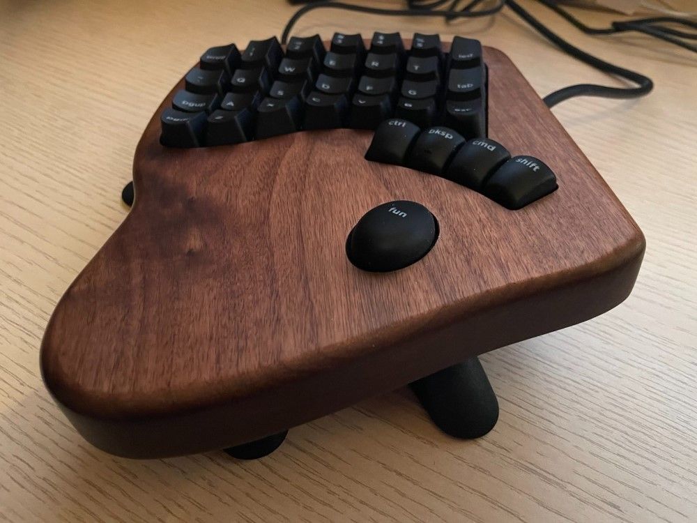
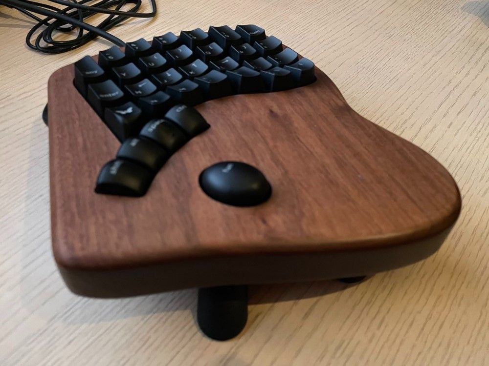
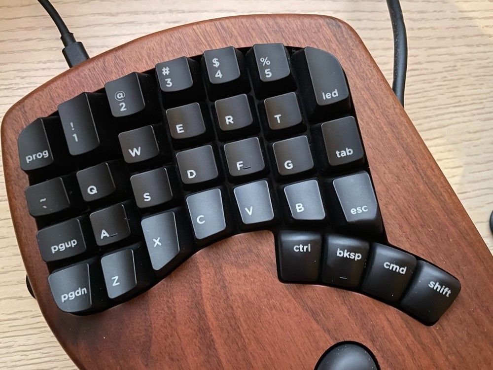
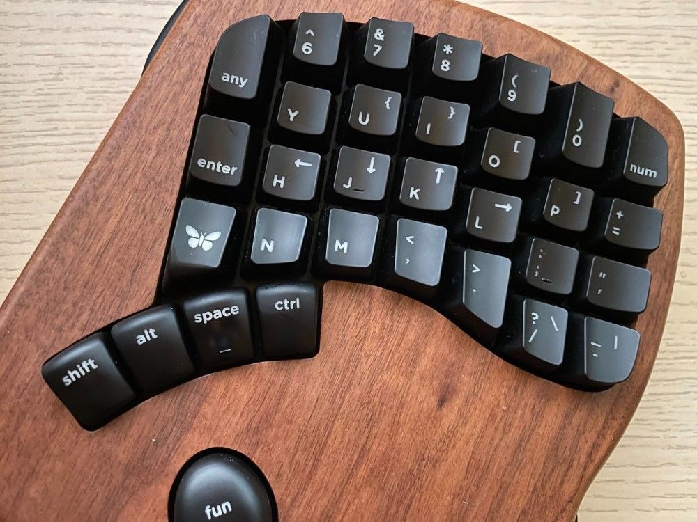
Additionally, it's the first keyboard I used where hands stick to their parts 100% of the time. In "normal" (single body) keyboards, some combinations were just more practical to perform while hands "wandered" or even crossed :) - but for M100, it simply would not work.
Most keys are exactly where you expect them to be (QWERTY ...). The most controversial design decisions are related to the following:
- the keyboard modes (as with 64 keys, you can't cover all the typical functions of a full 104-key keyboard)
- the control keys (because of hands stuck on their dedicated parts)
- the location of the most used keys - "esc", "enter", "space", "bksp", arrow keys
- the signaling of state switches ("caps" (lock), "num" (lock), etc.)
What's my opinion on that?
- First of all: the layout of M100 is significantly different than it was for Atreus. It's not an issue. In fact, I like M100's layout more, primarily because of how one switches the mode. There are two dedicated buttons for that ("fun": one on the right, one on the left) positioned conveniently just under your ... thenar (it's the part of your palm just under the thumb). Practically speaking, you don't have to move your hand in X or Y dimension to switch the mode. You just press the palm down because the thenar is conveniently placed (all the time) where it needs to be.
- The only other buttons that are present in both parts of the keyboard are "ctrl" & "shift" (symmetrically).
- Just like for Atreus - "space" is basically the size of any other key.
- My biggest challenges were related to the awkward positioning of "tab", "enter" and "esc" keys (in the inner sections of both parts) - which really required getting used to. Two other things you may find counter-intuitive are the order of the control keys in a bottom row (I still do peek there more frequently than I'd like to) and the fact that arrows keys are: in the 2nd mode (so they require using "fun") and positioned Vim-style (in a single row).
- Some popular keys (like "del" or "caps" (lock)) are hidden somewhere in the "deeper" modes: that's why I've learned to deal w/o them at all.
- The most frequent typos I make are: "cmd" instead of "bksp" and "num" (lock) instead of "0". As these two change the context (e.g., open the "Start" menu in Windows or switch the keyboard to "numeric" mode), such mistakes are pretty annoying.
Initial impressions
The first impression was very positive, but some details do not fit a product its creators want to be perceived as "premium". Which details do I mean?
- The main cable that one uses to connect M100 to the computer (USB-A to USB-C) is made of cheap rubber & doesn't look like it could avoid damage after getting trapped by the drawer or deformation after a long period of staying twisted. How about a braided fiber sheath (like the one Keychron uses for their product) instead?
- A much more painful realization came next: in the package, I've got two cables (RJ45 to RJ45) to connect both parts of the keyboard: the short one and the long one. The idea is to use the former if you want M100 as a "single-body" device & the latter if you don't. In practice, the short one is way too short to be practical - it was always very strained & I was afraid that I might accidentally pull the plug from the socket any second.
- When it comes to the initial configuration - I had zero issues. It was just a matter of getting used to the drastically different layout, which took me a few weeks.
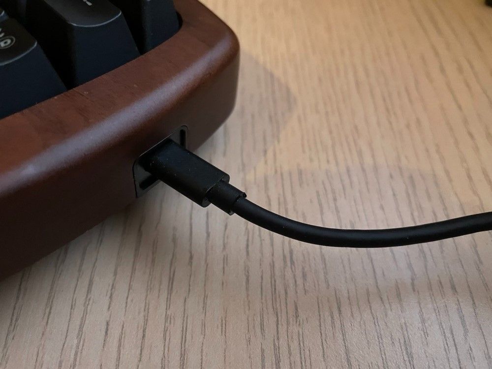
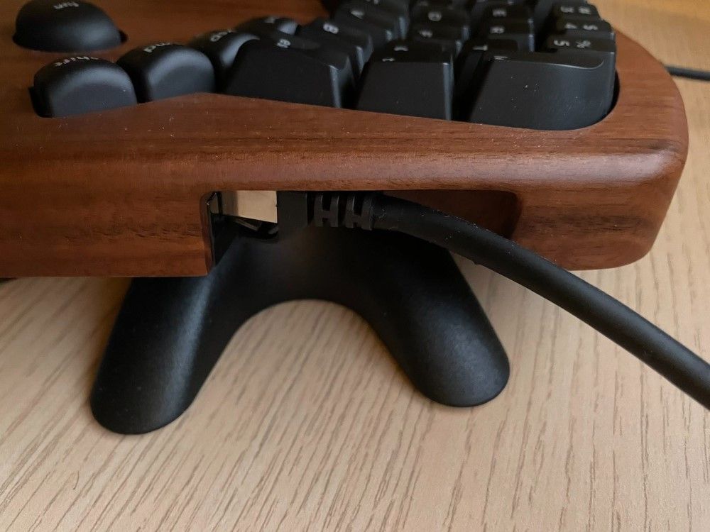
After a certain time ...
In time I've started noticing more & more details - some positive & some negative:
- I really love the way Keyboardio has sculptured the keys - how they are ALL within reach, how essential keys (like "tab" or "enter") in the inner column are positioned slightly higher (so you feel the threshold & avoid stupid mistakes), how control keys are always under tabs, and they are the only ones convex not concave - these well-refined details make using M100 a lovely experience.
- But we're not buying mechanical keyboards for their key positioning - at least, it's not meant to be the primary reason. Mekkies are all about feedback: both tactile & sound. To keep the long story short - I'm more than satisfied in this department. Yes, I had louder clicky switches, but they are loud enough, and the threshold of the keypress is very clear & leaves little space for mistakes. However ...
- ... while I had zero issues with using M100 with MBP, I could not eliminate extremely annoying glitches that kept happening on Windows machine ;/ What kind of issues? Oh, the most annoying ones: key input not detected after the keypress, key being repeated in the endless loop randomly after keystroke, keys coming in "batches" with a visible delay. These are precisely the issues one wants to avoid by buying the mechanical keyboard, and here they kept appearing with 10x the normal frequency (of a standard keyboard).
That was kind of killing the joy of using M100 with Windows. The frequency of the issue seemed to increase after I started using KVM & what's even worse - there was no guarantee that replugging the keyboard would solve the problem (temporarily). I admit, yes, there were times when I had to do something on Windows, so I had to grab another keyboard to do it w/o frustration.
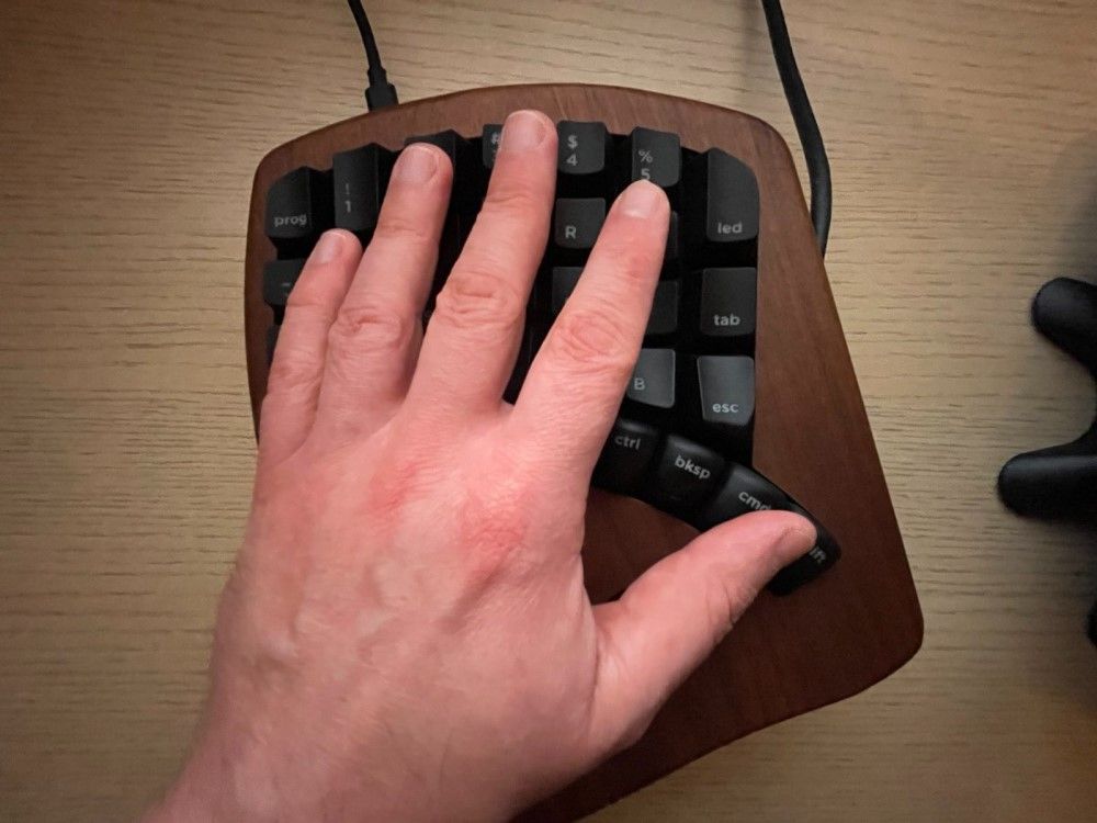
My plan is to experiment a bit more in the hope of pinpointing the exact conditions that cause the issue. For now, it seems completely random but it happens pretty much EVERY day. YES, that's not cool.
All M100's keycaps are backlighted with LED - which opens (in theory) space for some exciting capabilities. Unfortunately, the potential remains majorly unfulfilled - you have ~13 pre-defined modes and very little flexibility when it comes to configuring anything creative. Forget about custom notifications or complex, dynamic patterns.
Did I run any speed tests to compare the typing pace on M100 vs. other models? Nope. Frankly, what I need is not the sheer velocity - it's all about the fluidity of pouring ideas onto the screen without breaking away from the train of thought (because I'm not sure where there's no char missing or I need to strike a weird combination).
Parting thoughts
OK, let me summarize the review by answer a bunch of essential questions:
Q1: Would I buy M100 again if I could turn the time back?
A1: Ahhh, next question, please. Well, to be frank, it's good enough that I don't plan another switchover in the forthcoming months (and yes - there are some very tempting products ...). I like how natural it feels - maybe it's a matter of my hands' anatomy (I have short, thick fingers), but writing texts with M100 is very pleasant. However, there's the price tag as well ... 300 USD is A LOT of money, and one cannot avoid comparison to other (good) mekkies, which are twice cheaper (or sometimes even more). The honest truth is - M100 quality IMHO does not justify the price.
Q2: What is M100 good for? Gaming? Programming? Writing long texts?
A2: I think you've guessed already - M100 truly shines when you're into writing texts. The flow can be insane & the pleasure of writing is immersive. It's also crazy to watch - you write while your hands barely move. That looks ... almost unnatural. I can imagine using M100 for both coding & gaming, but it would probably require a lot of key/short-cuts redefinition (especially for multi-key dev combinations or sets of keys that should be within reach of a single hand in games played with a keyboard+mouse combo). I don't think I'd have patience for that.
Q3: Do I think it's possible to fix M100's drawbacks in time, e.g., with upgrades of the firmware or even additional accessories?
A3: Yes, I think so. I'm 100% sure my "stutter" problems on Windows are NOT caused by hardware (as they never happened on MBP). The subpar quality cables can be easily replaced with better equivalents (as they are based on open standards), and - last but not least - I hope Chrysalis will only get improved in time, provided more exciting ways to customize the keyboard's behavior. Fingers crossed.
P.S. I plan to update the article with additional observations if there's anything I find worth sharing with you, so stay tuned.


