I took my time. Both Windows 8.1 & Visual Studio 2013 (altogether with .NET Framework 4.5.1) have appeared few weeks ago, but as I was a bit skeptical about them, I’ve decided to give them a little bit more time, just to make sure evaluations won’t be pre-mature. Here we go then, the time has come:
Windows 8.1
I don’t care much for crap like "personalizing desktop colors", so let’s focus on what’s really meaningful:
- "Start menu" is NOT back, but I don’t care. People were crying a lot, so Microsoft brought up back Windows icon in the bottom left corner of the desktop, but it doesn’t work the way you expect it to. To be honest - nothing to stop by.
- Store’s forefront has been re-vamped - content is still the same, but now it doesn’t annoy you with plenty of empty categories.
- You’ve got more freedom about how you want to split your screen in Win8 mode: you still can’t have more than 2 apps open on desktop in the same time, but you can freely maneuver the splitter between those. Didn’t rock my world, but better than nothing.
- IE11 - some old scars can’t heal in a day, so IE is not (and won’t be for some time) by primary browser of choice, so I didn’t spend time on evaluating the changes on my own. Ah, but I like one change - when you click the link with right button, your context menu doesn’t appear on the link, but in options bar at the bottom - I find it much more convenient and accurate than previous option.
- Microsoft applications - there are some improvements indeed, for instance in Mail application that is now much more convenient to use (and less buggy). But if I were to use it as my primary e-mail client, I think I’d still give up on e-mail communication :)
- I’m not 100% sure, but I think that treating SkyDrive as one of the local drives is also something that was not present in original Windows 8 - it’s a small change, but improves the overall usability a lot. Good job, Microsoft, one more step to be at least as good as Dropbox ;P
Summary:
If you liked Windows 8 before, rest assured that you’ll still like it. If you didn’t, there’s a very slight chance you’re change your opinion as even it was called a major update, Windows 8.1 didn’t improve much (but fortunately it didn’t break anything either - it still works smooth and fast, even on Surface RT).
Visual Studio 2013
New Visual Studio every year and a service pack for the latest version each quarter? Awesome! But does it mean they are really speeding up with releasing improvements or they just want to release less but more frequently, to remain in par with more agile competition? I guess I won’t surprise you - it’s clearly the option B:
- Visually, it looks very similar to Visual Studio 2012 - the major differences are: information about the logged user (yes, you’re supposed to log in, using Windows Passport!), return of colored icons and notification icon in the title bar.
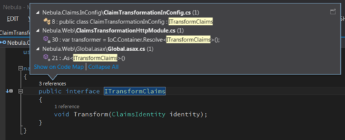
- Another meaningful, visual change appears once you open a code file - above every declaration (class, method, etc.) you get a CodeLens - read-only line with some information: how many times this particular item has been referenced in code, which changesets was it modified in, which SIRs are related to that piece of code. At first glance, it looks awesome, but … it requires Visual Studio Ultimate (the most expensive version) and the most useful information is visible obviously only when you’re extensively using TFS (yuck!).

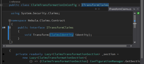
- There’s some improved navigation and searching via code, but to be honest I didn’t use it at all as ReSharper is still light years ahead in terms of providing navigation and search functionality for Visual Studio users. Sorry, Microsoft. There’s one cool feature worth mentioning though - "Peek Definition" (Alt+F12). You can open a referencing piece of code in an additional sub-window _within_ your current editor window (it doesn’t overlap the content, it makes it “fan out”) - this way you can observe several levels of call hierarchy on your screen in the same time and in a very convenient way. Why so late? :)

- I didn’t have an opportunity to have fun with debugging and optimization improvements (incl. edit & continue in 64-bit apps and asynchronous debugging), so can’t say much about those, but they sound useful. Same applies for improved TFS integration: a lot of what Microsoft announced sounds nice, but in this case my reluctance for using TFS is just too high to care at all.
- New Visual Studio is accompanied with a wave of new versions of important Microsoft libraries and frameworks: ASP.NET MVC 5 (incl. Web API 2) & Entity Framework 6 - these are completely different stories, but as for now, they are nice additions to sweeten the IDE upgrade.
Summary:
New Visual Studio is not a breakthrough. It doesn’t introduce any feature that’d seriously either impact productivity or extend the capabilities of this IDE. But on the other hand - the transition is smooth and doesn’t require solution conversation (and you can still use 2 versions of VS alternately when working with it).
What is more, new VS appears to run a bit faster and be more stable than previous versions (even VS2012). Most important add-ons have been instantly updated, so it’s 100% usable pretty much from Day 1 - are there any reasons to complain then? Well - I dream of a day when Visual Studio upgrades in-place like browsers do. Maybe one day…

