


TL;DR Right tool for the right job - this applies to such tiny details as fonts as well. If you spend a lot of time with written text, you should optimize this aspect as well, most likely even considering varying scenarios separately - I've set up a list of my favourite typefaces (font families) I find most useful on the daily basis. Keep in mind that this list is optimized for MY own use cases, so it may not be 100% fit for yours.
I believe in small details that altogether, if adjusted with high awareness, make (in total) a huge differnce. That's why I pay so much attention to such "mundane & irrelevant" no-brainer stuff like: keyboard I use on daily basis or font I use for reading large amounts of text.
I've already written about my craziness regarding mechanical keyboards - how I value both sound & touch feedback, that helps me unconsciously fix typos / inaccuracies (in typing) before I even realize them. Now it's time for some font appreciation ...
#fontfetish
Why do fonts matter (for me) then? I work with written content a lot - (e-)books, various types of docs and code, plenty of code. Needless to say, my activities are for the most part all about READING, not WRITING. Still, that are many, different reading scenarios, e.g.:
- sometimes it's all about endurance - I read something for a long time & my priority is not to get tired too soon -> font has to be readable, very clear, proportions do not matter, I don't care about ligatures, etc.
- sometimes it's all about range of information visible in the same time - I'm in problem-solving mode & want to "embrace" as much content as possible on 1/2/3 screens - it still has to be readable, but short-term not long-term
- sometimes it's all about language specifics -> some languages are more verbose, some are more concise; for some layouts tends to be more horizontal, for some it's very vertical -> I adjust font h/v ratios to optimize for readability (e.g. Hack/Monoid for verticals, Input/Iosevka for horizontals)
- there are specifics fonts I use for reading non-tech content ofc (Ember, Bookerly)
I consider it important enough to pay (in some rare cases) ~200 USD for particular font (non-web, single-machine usage). I'm not saying everyone should/has to, fortunately there are some very good free fonts available as well. Here are the ones I recommend - you may be surprised, because this list does not match the typical selection you can find on google ("best programming fonts"), but well - this is what's optimal for me, I can't say for the rest of the world.
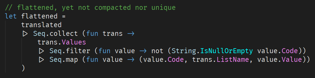
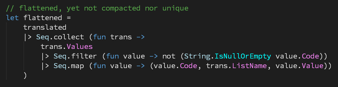
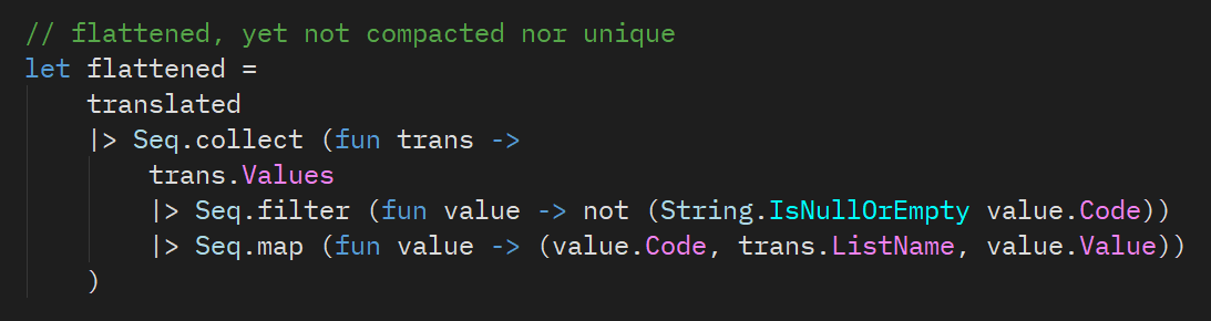
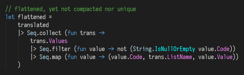
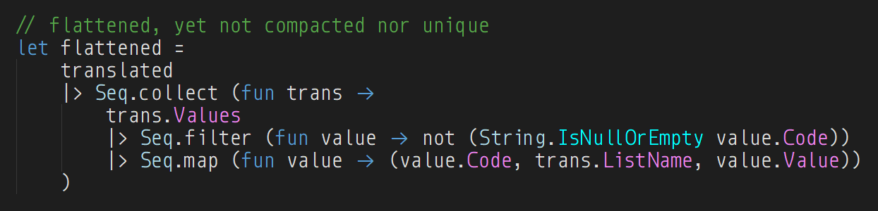
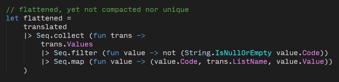
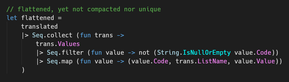
Disclaimer 1: I've put small screenshots to show the differences between fonts, but keep in mind that they are small, made in the same IDE, with the same piece of code.
Disclaimer 2: Ligatures differ between languages, their support differs between IDEs as well - even if some font supports ligatures in general, it may NOT be visible on some screens.
Fira Code
Link: https://github.com/tonsky/FiraCode
My favourite. Not really popular, quite the contrary, but it's almost (95%) as readable as SCP (check below) PLUS it has BY FAR the best ligatures (among free fonts). Are ligatures that important? It depends - if you're doing FP, the difference IS perceivable. These days pretty much all proper editors/IDEs do support them, so why not to utilize this advantage?
Source Code Pro
Link: https://adobe-fonts.github.io/source-code-pro/
The most readable code font I know, purely beatiful - my default choice if I try new language / setup / code-based scenario. Very universal, font size proportions that will never hurt your eyes. Feels very natural, WITHOUT any "artificial" differentiators between similar characters (like 0 and O). I am not a fan of Adobe as a company (exactly the opposite), but this font is a masterpiece.
Plex Mono
Link: https://ibm.github.io/type/
A new challenger, and a very serious one (full take on SCP) - I'm still trialing it, but it works surprisingly well. And again, it's a product of company (IBM) I wouldn't suspect of being able to create anything useful ...
Iosevka
Link: https://be5invis.github.io/Iosevka/
My favourite in the group of narrow fonts. Not really popular, very few people have heard about it, but deserves some love - fully pro product, pretty much no flaws in its category. Decent ligatures!
Monoid
Link: https://larsenwork.com/monoid/
My favourite in the group of bulky fonts, preferred for more vertical-friendly languages. Very, very pleasant to read -> not too roundish, but it's not a problem at all. FP-friendly ligatures are present.
Input Mono
Link: http://input.fontbureau.com/
My former favourite - I used to rely on it completely, before I've discovered SCP & FC (and found out benefits of differentiating fonts) - definitely worth your attention, ESPECIALLY because it's homepage lets you customise few "controversial" characters between 2 options (e.g. "g", "i", "o").
<3<3<3
Hack
Link: https://github.com/source-foundry/Hack
Slightly more bulky SCP (not a fork, just similar), with some tiny optimisations for the sake of readability - yet somehow I used to prefer others over this one, not sure why - maybe you'll like it even more.


